
How do colours effect your emotional behaviour?
Colour psychology is a theory that certain colours can have an emotional effect on our brains which in turn effects our behaviour and emotions. Whether these are warm or cool colours, calming or stimulating colours or happy or sad colours they can effect us in different ways.
Liking a colour or not can often depend on a past experience you had as a child which can subconsciously be linked to that colour. For example, you might have had a favourite toy in a certain colour which subconsciously then becomes your favourite colour.
Colour also has a direct effect on your mood. Wearing a certain colour or walking into a space that is painted a certain colour can effect how we feel. For example, You might like to wear a bright colour to lift your mood.
Below we break down the basic colour wheel and explain how these colours can make you feel. We discuss what impact they can have on our emotions so that you can learn how to use colour effectively within your home interior.
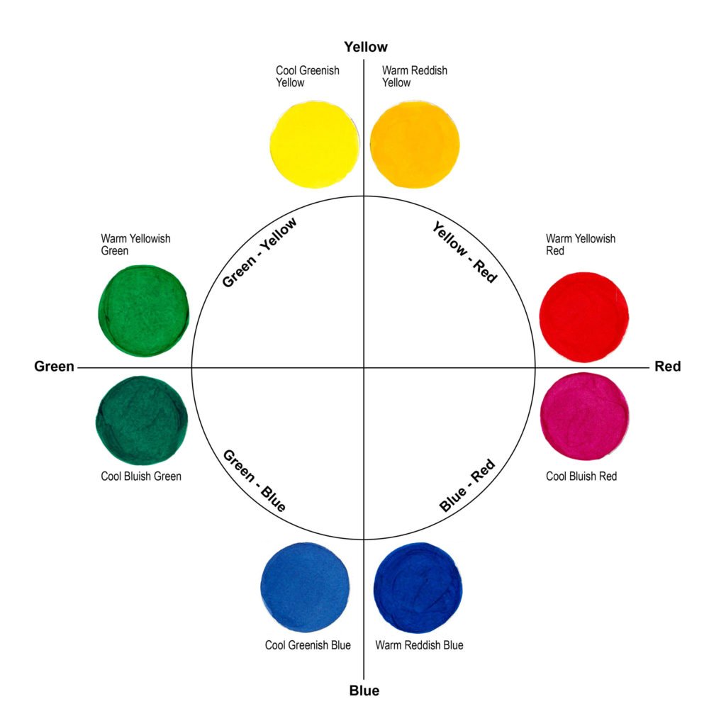
Image source: justpaint.org
Warm Colours
Warm colours most commonly consist of red, orange and yellow. These can make you feel warm when looking at them and also stimulate feelings of happiness. These colours can be attention grabbing, energising and stimulating.
Our suggestion for using these colours within your interior is to select a tone in the colour family such as tangerine, mustard, burnt orange or turmeric. By doing this you can take advantage of the warm, optimistic, emotions they convey without the colour overpowering the room. Alternatively, using colour as a small focal point within a room is another good way to introduce colour without saturating the space.
Red - Can produce strong emotion and is often associated with danger, love, passion and anger. It’s a very stimulating colour which can energise and excite. Sometimes used as a colour of power, too much can be overpowering and have negative effects. Red is also said to increase respiration rates, and raise blood pressure.
Orange - Radiating warmth, orange is seen as optimistic and happy. It’s used for rejuvenation and encourages enthusiasm. Combining the stimulating properties of red and the cheerfulness of yellow, orange exudes confidence and success.
Yellow - Uplifting and illuminating, yellow is cheerful, playful and brightening. It’s a creative colour and is seen as a colour of new ideas and hope. Too much yellow can however cause anxiety, apprehension and stress if not used appropriately and in the right tone.
Mixing warm and cool colours
Using this cherry red as a pop of colour against the cool blue interior has helped to balance the space and created a focal point without overpowering.

Image source: Pinterest
Warm Colours
Using tones within the yellow colour family such as turmeric is a way of adding warmth and optimism without overpowering the interior.

Image source: Pinterest
Cool Colours
Cool colours most commonly consist of green, blue and magenta. These colours can make you feel cool and stimulate feelings of calm. Cool colours can often seem to recede, making them great for use in small spaces, such as a powder room, making it visually appear larger. Cool colours are great for use in relaxing spaces, retreats, and meditative spaces.
Green - The colour of nature, green symbolises harmony, healing and security. A popular choice for associating with natural, organic, environmentally friendly products and spaces.
Green can also be associated with envy, greed and jealousy if not used in the appropriate circumstances and in the right tone..
Blue - Serenity, calm and loyalty are all associated with blue tones. A conservative colour, blue calms tension and fear, slows the pulse and also is said to reduce the appetite. Considered to be a safe colour, blue is often preferred for business as it relates to trust and honesty.
Purple - Best know for its spiritual association, purple symbolised imagination, fantasy and creativity. It also associated with wealth, royalty and superiority. Those drawn to purple are often said to be sensitive and compassionate with a peaceful, tranquil quality.
Cool Colours
The use of mauve on the walls creates a calm, sophisticated, tranquil space.

Image source: Pinterest
Cool Colours
Dark green cabinetry can make the size of a room appear smaller and cosier.

Image source: Pinterest
If you want to brighten up a dark space consider light reflecting colours. To give more contrast to a space that is flooded with light consider darker colours.
Calming Colours
Cool colours are perfect for use as calming colours as they are low in contrast. Pastel tones such as baby blue, lilac and mint can all have calming effects. Neutrals such a cream, beige, and browns that reflect the earth and nature and also have a calming effects. These are often used in retreats and health and wellness settings for their relaxing connection. These are great to keep in mind if you are working on a commercial project that requires a tranquil setting or want to create a calming environment such as a childs bedroom.
Stimulating Colours
As previously discussed, bold, warm reds and oranges stimulate the brain and energise the mind. These are often associated with heightened emotion.
Pink tone can make you feel playful and romantic and are often used in beauty environments for this reason.
Neon tones and bold, bright highly pigmented colours also have this effect and are used to grab attention and excite.
Calming Colours
Earthy neutrals have a lovely calming effect on a space and are perfect for retreats or tranquil settings.

Image source: luluandgeorgia.com
Stimulating Colours
The contrast of this bright watermelon combined with an earthy green makes the space feel playful and happy.

Image source: Pinterest
Happy Colours
Bright, uplifting colours create happy emotions. Colours such a pink, yellow, watermelon as well as some pastel colours such as peach, lilac, and lime all can be used to lighten the mood.
Using these colour along with a calming colour can create a visually interesting space and have a very positive effect on the viewer.
Sad Colours
Grey is the ultimate sad colour. Too much can make a space feel dull and drab. Black, deep dark blues, greyish greens and muted colours in some cases can also have an effect on emotions making you feel unhappy.
Use a mix of happy, uplifting colours with more muted colours to create a balanced colour scheme that is both pleasing to the eye and has a positive effect on emotions.
Happy Colours
Using a pop of pink on this door brightens up the space and creates a happy entryway.

Image source: Pinterest
Muted Happy Tones
Mustard yellows and blush pinks compliment each other to create a happy childrens bedroom without over stimulating.

Image source: davisandcointeriors.com.au
What’s the best way to implement colour in your home?
When implementing colour into your home think about what effect the individual colours have on the overall aesthetic you are trying to achieve. Commonly calm, neutral colours are great for resting spaces such as bedrooms and living rooms. If you are adding colour into your bedroom think about using more muted tones and keeping these to statement pieces such as a bedhead, artwork or bed throw. This will brighten the space without over stimulating the room. Check out our post on styling a coloured bedhead 3 ways.
You might also want to add a splash of colour in the kitchen or in a home office to energise and stimulate. A children playroom is another great opportunity to add colour to encourage creativity and happiness. This can be done by using coloured furniture, bright artwork, colourful bedlinen, or a bright rug.
In Short…
When selecting colours for your project it’s important to think about the mood you are wanting to create and the feeling you might get when in the space.
Knowing your colour theory and how it relates to different emotions is the first step.
Knowing how to use colour effectively within your desired colour pallet and how to relate this to your chosen aesthetic is the second.
Most importantly have fun with colour. It’s a great tool to brighten up a room and add life to an otherwise bland space.
For more help with your colour selection, book our colour, finish and fixtures service or chat to us to discuss your colour needs.